Accessibility is often perceived as hard and costly. When we talk to designers and developers, they often see designing for disabled people as a niche that affects only a small number of people. In this article, I hope to debunk some of the myths and walk you through some design, code, and content considerations.
What is accessibility?
In short, accessibility is the degree to which a website is available to as many people as possible. Although we can explain that in a broad sense, in general, we talk about accessibility when we make sure that our products and services work (well) for disabled people.
When you design and build websites and web tools properly, disabled people can use them. However, many sites and tools are developed with barriers that make them difficult or impossible for some people to use.
Accessibility opens up your products and services to many more individuals, which is not only great for them, but also good for business.
Do disabled people use the web?
They certainly do. For people with limited mobility, the web may even be the only way to perform everyday tasks, like banking or grocery shopping.
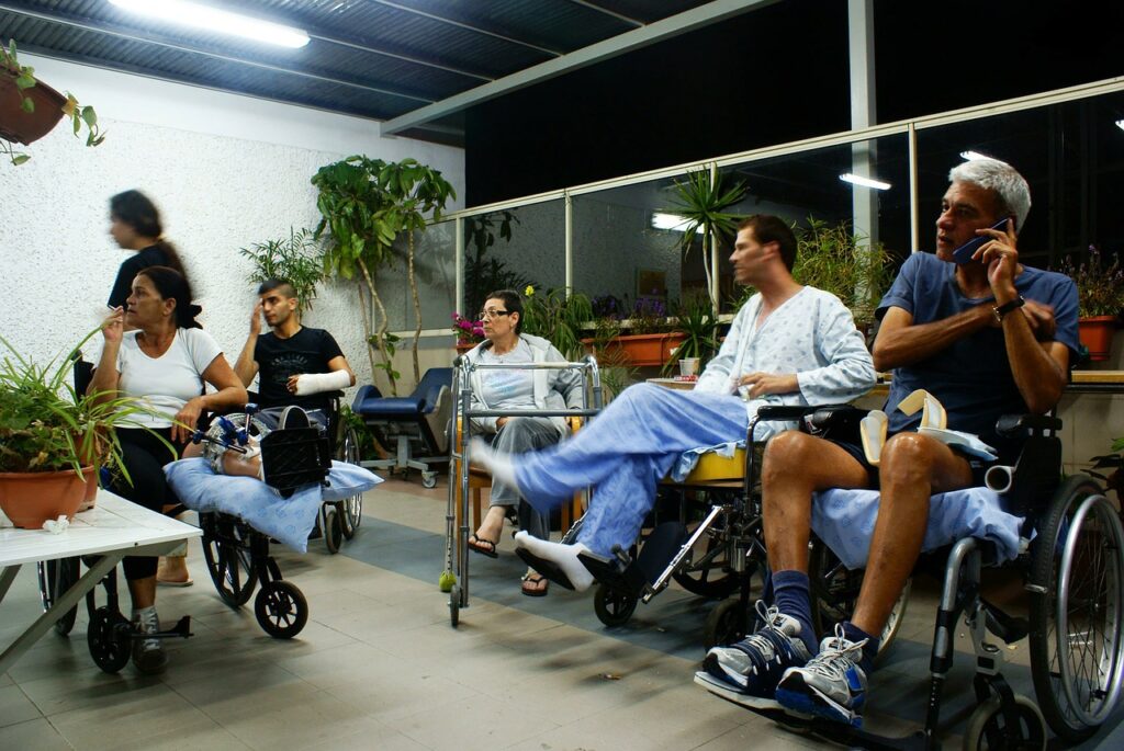
It’s also good to keep in mind that having a ”disability” doesn’t always mean what may come to mind first. Not every person with a disability has a guide dog or is in a wheelchair. Physical and cognitive impairments take many shapes and forms and they exist in varying degrees of severity. They can be permanent, situational or temporary. For example someone who suffers from spasms (permanent), a parent holding a baby (situational) or someone with a broken arm (temporary).
Types of disabilities
We can roughly divide disabilities into four categories:
- Visual, like blindness, low vision or color blindness;
- Auditory, D/deaf and hard of hearing;
- Motor, like limited fine motor controls or joint pain;
- Cognitive or intellectual, like low literacy, dyslexia, or autism spectrum disorders.
How many people are disabled?
This is not a small group of people, according to a report on disabilities published by the World Health Organization, over a billion people live with a disability. That’s about 15% of the world population who may experience difficulties from using our services on the web. Or worse, they may even be excluded.
What kind of obstacles do disabled people experience?
The obstacles disabled people experience depend very much on the type of impairment they have, just like in the physical world: someone who is in a wheelchair has no use for braille, and a wheelchair ramp won’t help someone who is hard of hearing. The same goes for the web. Accessibility is not binary; something is not simply accessible or inaccessible. Worse still, a website can be usable for someone who uses screen reader software, but when there’s a video on that website without captions, that will be unusable for someone who is deaf.
Blindness and deafness are obvious examples when we talk about accessibility and disabilities, but also people with low vision, color blindness, spasms or dyslexia experience obstacles when they’re using the web. These people may use the same visual representation that most people use, but each one may experience different obstacles that render the website unperceivable or inoperable.
Someone who is colorblind will have difficulty recognizing links on a page when their only visual distinction is the color, but they are not underlined. Someone who doesn’t use a mouse but a keyboard may have difficulty operating a website when interactive elements only change color when you hover your mouse over them.
This shows you that different accessibility needs ask for different solutions.
Accessibility benefits everybody
The exciting thing about accessibility is that it’s not only an excellent indicator for general usability, but it can also benefit people who may not have long-term or permanent impairments: a wheelchair ramp benefits not only wheelchair users, but also a parent who is pushing a stroller. A video with captions benefits benefits a deaf person and someone who want to watch it when they’re in a noisy coffee place.
Provide comparable experiences
Captions are a form of alternative content: the sound that’s playing in the video is also available as a written text. There are similar solutions for images, screenreader software can’t describe what’s in them, so we use the alt-attribute to describe what’s in the photo, illustration, or infographic.
Much of accessibility is making sure the interface you design provides a comparable experience for everyone: visual and non-visual users, keyboard and mouse users, autistic or neurotypical. That way, everyone can accomplish tasks in a way that suits their needs.
Starting early makes it easier
Honestly, it can be a lot of work to design and build a website and trying to make it accessible. However, often that’s because it was bolt-on afterward rather than built-in from the start. It’s a lot of work to design and build a website and trying to retrofit accessibility into it, changing colors because the color contrast doesn’t comply with WCAG guidelines, updating images in the CMS with proper alt-attributes, rework forms fields because they can’t be operated with a keyboard. That’s a lot of work.
That’s why it’s essential to design with accessibility in mind from the beginning. Design a color palette that has enough color contrast, write alt-attributes as you’re uploading images, code input fields in a standards-compliant way, and write error messages that everyone can understand.
This may be more work than not doing it all, but it doesn’t come close to the amount of work you’ll have to do over when you discover that you’re excluding a large group of your target audience.
Quick Tips
- Use plain language
- Design with enough color contrast
- Write semantic, meaningful HTML (use
<a>and<button>appropriately). - Indicate focus for non-mouse users
Accessibility is usability, for everyone
Look at accessibility as just another aspect of the user-friendliness of your website, just like having a responsive website and optimizing the performance are.
